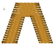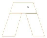

Letters often look better with a set of satin columns, rather than turning around hard angles. One method commonly used is with three satin columns: and entry, and end ‘cap’, and the exit stroke. A typical example is this letter ‘A’:


You’ll see that the cap angle is as ‘flat’ as it can be so that the stitching is smooth. For registration purposes, you may want to overlap the cap on top of the entry column. And the exiting column usually is best to be snug against the cap. In the illustration on the left, notice the slight overlap of the left column and the cap – barely a stitch is typical.