When making fonts, there are some basics that you need to understand. First, and most important, is that fonts and embroidery are not friends. Font designers get away with things that embroiderers cannot. Most notably, font designers have no restrictions on stroke width – or the variability of it. A glyph can have a super narrow column alongside a super fat column. Assuming that you’re making a satin font, the lettering sizes are restricted by these column widths. A minimum column width of 1.5mm is typical. A maximum width of 7, 8 or even 9mm is about the most you will want to use, in general circumstances. If your glyph has sections that are 7mm wide and sections that are 2 mm wide, you have sizing constraints. The answer to this problem is to make the font stroke thickness more regular. Embroidery font designers do this all the time, and that’s often for fonts designed for a specific size. If you’re making fonts that should be able to scale up or down, you need to pay more attention to that problem.
The next issue is overlaps. Fonts on a computer don’t have layers -- the letter is a filled color. With embroidery you can see the order that the machine stitches the letter. And the human eye tends to have an opinion about what looks right in that circumstance. There are also embroidery-related reasons for having layers set correctly, particularly registration. Two satin strokes that touch may have a slight gap, or a slight overlap, both of which may not look right.
Another digitizing problem is turning acute angles. In a word, our advice is, “Don’t.” Take a look at the following image which shows three methods of turning tightly.
Three methods of turning
The bottom left, center, and bottom right are various methods of turning tightly. Can you spot the worst one right away? If you said the center, you are right. The center simply turns around, making long stitches and high density (even with short-stitching). This turn is ugly and unnecessary.
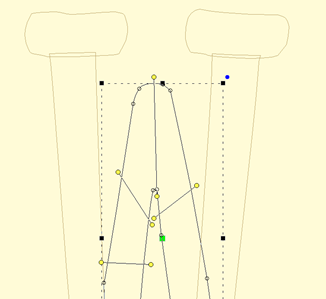
Look at the bottom right. This is a form of overlap, and there are a couple ways to do it. This way doesn’t look bad in many cases and is easy to accomplish. Its best benefit is that the stitch lengths remain at the width of the columns.
The bottom left has a couple things going on, including a cap object, which is shaped like a bowl at the bottom of the letter. It also has the two strokes coming down to the cap with nice, even, parallel stitches that actually shorten just a bit as they get close to the cap. The strokes do not overlap, but look like they do. They could overlap, but having them ‘kiss’ makes for better branching, as this will look the same, no matter which way the letter runs, left-to-right or right-to-left.
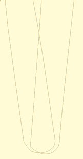
The downside of a cap is that it has to be a bit wide, and that width may make for a long stroke, so keep it in mind. A way of dealing with that problem is to adjust the shape of the letter.
At first glance, you may not see the difference. Here, we made the width of the cap narrower. In this case we set it to 7mm, which is comfortable to sew and that allows this letter to sew at 35mm in height. Notice that the left vertical stroke looks a bit wider at the top. We left it that way so you could see how the verticals should narrow a bit in order to meet the cap at its new width. You could accept the font like this, but it is more likely that you’ll narrow the whole column.
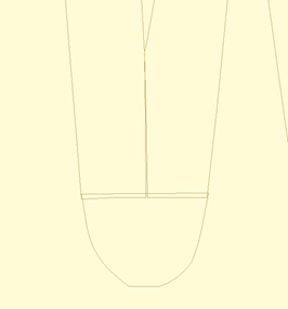
This version has been normalized a bit, so the columns are slightly narrower. The result for the embroiderer is that this letter can sew 25% larger than when it was faithful to the original art.
Digitize your lettering for the approximate size you want it sewn at. Naturally, having objects allows for the designs to be resized by the user, and that’s nice, but if you would like a small version of the font, makes one. Shrink it down in size and then study the column width. If you can, fatten them up a bit, and you’ll have a smaller version of your font.
Connecting strokes
Consider the angle at which strokes connect. Right angles make the strokes more obvious, tend to have shorter stitches, and provide branching a way to move to the next stroke.
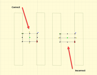
Keep strokes nearly perpendicular wherever possible
Strokes at angles have another set of possibilities. When the angle is acute, you might be tempted to turn the inclination to be aligned with the stroke it is meeting. This can be done for shallow entry angles.

Stroke connection types
In the illustration we can see four common types of strokes. The Turn is the most common and has issues with high density along the inside edge. Short stitches can overcome this, as seen in the illustration, but it’s going to be a more textured edge than the others and should be avoided unless the turn is not significant.
The Parallel to Point is common, but has the disadvantage of bringing a satin down to a point, which contributes to knotting underneath the fabric and may even break needles.
Parallel with underlap has the advantage of smooth edges and prevents the point issues by allowing the final stitches (show here at the top of the right stroke) to have length reasonable enough to be sewn without trouble.
The shallow turn with underlap also works because the density variance is not so great as to attract attention and the final stitches are long. The amount of overlap this uses can be a bit much if you’re making large lettering. In that case, choose the Parallel with Underlap.
For small lettering you might consider a combination, shaped similar to the parallel underlap but with the gradual turning inclination.
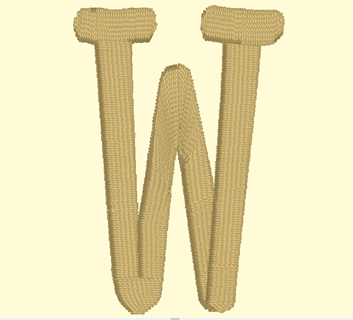
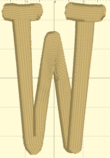
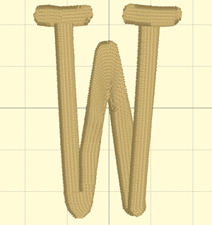
Whatever methods you employ, keep them consistent across the font, where possible, especially in similar letters, such as M, N W, V. Bear in mind the likely size of the letters when sewn, as size affects what you’ll do when digitizing.
Size
The size you digitize to is somewhat important. If you digitize at a large size, you’ll notice the design will change slightly when reduced. Inclinations that look good at a larger size may not be appropriate when the font is made small. We recommend you digitize the lettering at the default size you want the font, then edit it at the smallest size you think it should go. Going up in size does introduce some other issues but they are less profound then going down in size.