Lettering has a ‘Baseline’ which is an imaginary line where all the letters line up so that they are readable. The text you are currently reading has a baseline at the bottom of most letters. Some letters such as ‘j, y, p and q’ have ‘descenders’ that extend below the baseline. Sometimes a font, particularly a monogram, will use a baseline not at the bottom of the letters, but at the top (or more likely, center) of the text. Use the ‘Baseline’ drop box to change the baseline if you are importing a monogram font that should be centered vertically (center) or align at the top (Top).
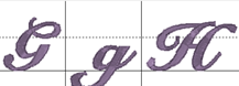
Sometimes individual letters require adjustments for their baseline. In the view, the pictures of each letter are shown, with a black line representing the baseline. Click on a letter to select it, and once selected, drag the letter up or down as necessary to place it relative to the baseline as you like.
Some things like apostrophes always need adjustment, naturally, but letters with descenders like “g” or “y” will usually need adjustment also. To move more slowly, hence more precisely, hold the Ctrl key while dragging.