Font Extensions add letters, punctuation, sizes, replacements and named alternate glyphs to any native font.
Any user can use extensions. They are used by typing in with the lettering tool.
Digitizers with Level 3 can create and publish them, even create .BX installers for them. These extensions are .BE files published to the library folder under /Fonts/Extension
Letters, punctuation marks, accents etc. are all universally called glyphs. Glyphs are any letter or image made to be read.
We will often refer to glyphs, the generic term for letter, punctuation, etc.
Extensions can do the following:
1.) Extensions allow new glyphs to be added to an existing font. This is useful for languages that make use of letters not found in the original font. The Spanish enye ñ is a classic example.
2.) Extensions can replace glyphs in the original font. This allows normal typing, with that font selected, to use the glyphs you digitize or adjust, instead of the originals.
3.) Extensions allow alternate size versions of glyphs. As size varies, digitizing needs to be adjusted. If some glyphs in a font need adjustment for regularly used sizes, you can store those alternate size versions in the extension. The best-case size will be used as the lettering is generated anytime the user adjusts it.
4.) Extensions can have alternate sets of glyphs. Sometimes there is a need for some, or all, of the letters in a font to have decorations, ex: Graduation hats, or bat wings, or hearts or stars, etc. Those alternate glyphs can be named and used as named alternates.
Extension pages can operate on more than one font. A customer, project, or job can have their alternates, replacements and sizes for all font use kept together in one file.
Multiple extension files can add to a font. Users can enjoy extensions from multiple sources.
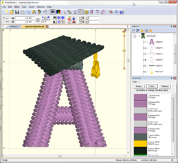
Digitized letter ‘A’ with graduate cap
Left: Design as digitized; Right: In use as lettering.
Extensions allow replacements and alternates. In order to have the lettering system select those, the use of the vertical bar | is used in the text field of the letter properties. The vertical bar, also known as a pipe, may appear as a ‘vertical line broken in the middle’ on many keyboards. The vertical bar was chosen because it is available on any keyboard, and yet it is not used in any language (other than computing).
Within this text, we refer to the vertical bar | simply as “bar.”
Digitizers can distribute font extensions using .BX installer files, as long as the fonts being extended allow republishing. If they do not, you may still extend the font for your own use, but you cannot redistribute the extension, as it contains copyrighted work that the author does not wish to have republished.
Alternate Character Sets
In typography, one of the lesser-known features of font formats such as OpenType is that they may include alternate versions of some glyphs. Different artistic versions of some or all letters may be included with the font. Most users aren’t aware because they simply don’t know how to select them, if they have such a font. Designers and artists use these all the time, though, because having the original font with different expressions can be useful and creative.
Alternate character sets in extensions are similar. Perhaps they are best explained as altered or decorated glyphs, or simply decorations as lettering designs. Some examples might include drop caps; making < and > designs to add to a monogram font for the outer edges, but with several variations; or adding a heart to every uppercase letter. There could be long and short versions of letters with descenders, such as ‘y’ and ‘p’ so that the descender goes under the previous letters (or not); or even versions of those which contain banners or other design elements. There are so many purposes that they could not all be stated.
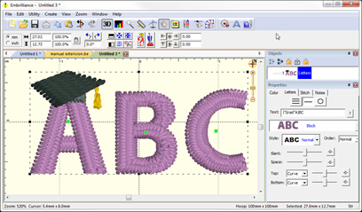
Use of Extension Designs (Lettering Tool)
Font extensions work behind the scenes, adding to what you’re able to type, adjusting for size, or even replacing certain letters with preferred versions. As a user, there are only a few things to know.
Each font, when selected in the Properties of a lettering design has a ‘?’ button that pops up a window, showing all available letters. This window will show any extensions and alternates.
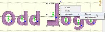
When you have selected a lettering design, or characters in a lettering design, you may right-click on the lettering and choose an alternate from the context menu that pops up. If there are alternates available for the selected letters, you will see the pop-up menu “Alternate” with a submenu of choices.
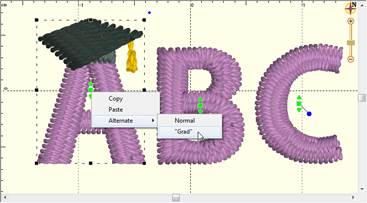
Selecting an alternate using the context menu
Selecting an alternate from the pop-up menu will adjust the text in the properties for the lettering and regenerate the letters. Using the menu to select the alternates may help understand the language of alternates, as you will see the text in the property pane change as if you typed in the alternate yourself.
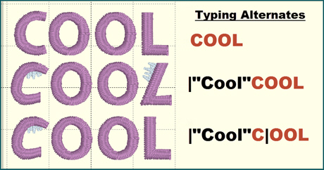
Typing Alternates
If you want to enter text that uses alternate, type the vertical bar followed by the extension name, then the text. For instance, a nifty letter ‘C’ in alternate set named ‘1’ is typed: |1C
Suppose that you want to type ‘COOL’ but only the ‘C’ should be the fancy one? You can stop using an alternate with a second bar: ‘|1C|OOL’ The bar ‘|’ sits in front of, and after, the ‘C’ to control what text is using the ‘|1’ alternate.
If some letters don’t have that alternate, their original will be used. Thus, if ‘C’ and ‘L’ have alternate versions ‘1’ but the ‘O’ doesn’t, typing ‘|1COOL’ will use alternate 1 for the ‘C’ and ‘L’ but the ‘OO’ will be normal.
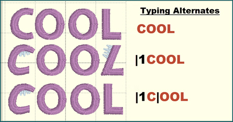
Typing alternates (black) using 1 as the alternate name.
Typing alternates (black) using “Cool” as the alternate name.
Multiple alternate sets are permissible in one text: |1ABC||2DEF| - In this example ABC uses the alternate version’1’ and the DEF uses the alternate version ‘2’.
The vertical bar is a glyph too, so how is it typed? Use the | and follow it with a space. No alternate selection will be made, and the space will not be used.
Alternate names like ‘1, 2, a, b’ are not very descriptive. Words or phrases can name the alternate set by typing the bar followed by the name quotes. Ex: |”heart”text… - or - |”grad” text…
Note: If you intend to run the alternate to the end, you do not need the last | at the end.
You can always use the Normal version, instead of the replacement by selecting it or typing |!
Part of the extension capability is the ability to replace glyphs. Typing normally will use the replacements. The user may also elect not to use the replacements by typing the special alternate name ‘!’ ex: |!text This tells the system not to use any replacement and only use the original.
To begin, create a new design page. Add a lettering design to it using the font you wish to extend. Do not change the size. It does not matter what the lettering design says, so we recommend leaving it ABC. The purpose for this lettering design is to let the system know that the designs to follow will affect the specific font used in the lettering.
Letters/glyphs are each represented as a design on the design page, as seen in the preceding Publishing Fonts section of this manual. You can create designs and add them following the lettering design described above. How you name them will decide how the system uses them as described in the preceding ‘Naming of Extension Designs’ section.
All glyph designs should end with a baseline: A two-point line object that identifies the vertical location of the letter with respect to other letters in use. It wouldn’t make sense if your comma was floating up, off the baseline of the letters, hence the use of baseline objects to keep things level. This is common in all typography.
The size of a glyph, as digitized, is its default size. This is the reason to initiate the new page with lettering at its default size: It lets you create new glyphs at the correct scale for the rest of the font. You can create additional sizes of glyphs, but the first one with a given name is the reference for the others, which are chosen based on how the user resizes their lettering.
To extend multiple fonts on one page, simply add them: After one font is extended, add another lettering design (Using the next font), followed by those extension designs.
Naming of Designs in Font Extensions
Naming of designs in the font extension is important. This is how the system will know which design to use when creating lettering. In all cases, the design name begins with the keystroke that is used to type the letter. Uppercase letters will then place a ‘U’ to indicate a definite case. Monograms will have L, R, D for (left, right, second name) placement or position. This is all covered in the Publishing Fonts section of this manual. The additional information regarding the extension-specifics of these designs follows those design names.
The simplest naming convention applies to extending a font. Extending a font is the process of adding glyphs that are missing in the original font, ex: language-specific characters. To extend a font, simply add the designs you want and name those according to the keystroke you wish to use. No other information is required.
Various Extension Designs
Replacement glyphs are named the same as the original glyph, followed by a bar. For example, to replace the lowercase letter ‘a’ in a font, add the design named: a| where the | indicates the default letter is being replaced. The user types an ‘a’ but gets the design ‘a|’.
Alternate glyphs begin with letter, as usual. The name of the alternate comes next: The vertical bar followed by one or more letters. For example, ‘|1’ represents an alternate named 1. ‘|A’ can be used for alternates named A. You cannot use exclamation point or zero (‘!’ or ‘0’) as these are reserved for other purposes. If you want to use a word or phrase to describe an alternate, enclose it in quotes as follows: |”cool” - This will allow the user to have useful names describing the alternates.
Alternates can be made any number of glyphs in the font. For example, if you come up with a decoration you apply to each uppercase letter in a font, you may want to name them all using the alternate. Ex: AU|”cool” then BU|”cool” etc.
Extending a Font
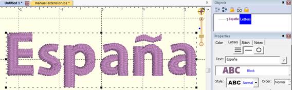
To extend a font, you can create a new design and digitize a letter, mark or glyph. Name the design with the keyboard key that will be used to access the design. For instance, if you’re extending the font with the Spanish enye letter ( ñ ) simply type that as the design name.
If you have a base character, such as the ‘n’ in this case, make a lettering design using that font with the letter ‘n’ as the text. Right-click and Convert to Objects. You now have a design that can be used as a starter for your new glyph.
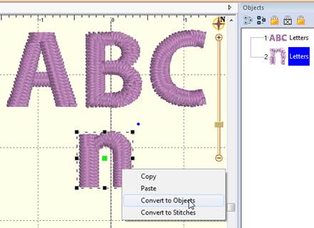
Lettering added, converting the ‘n’.
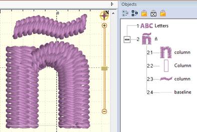
Enye Created, named in object tree.
Note original Letters design required.
Publish the extension.
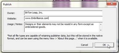
Add copyright information.
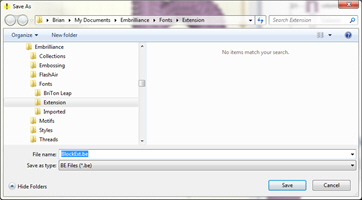
Save the extension into the Fonts\Extension folder.
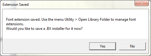
Optionally, you can make a .BX installer, if allowed.
You can now type with your letter!
Once published, you can type normally, and that glyph will be used as if it were part of the original font. You do not need to specify any alternate name to extension glyphs.
Replacement Letters
Sometimes a font is nearly perfect for the job, but one or a few letters aren’t quite right. Sometimes, when creating a logo design, an artist will begin with a font and then modify a few glyphs to create the desired logo effect.
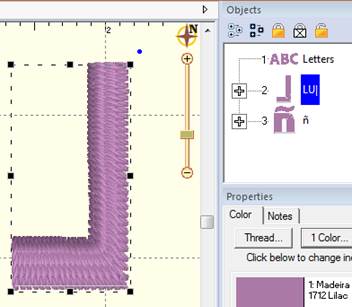
Backwards ‘L’ for a logotype. Letter named LU|
The resulting backwards ‘L’ typed normally.
Other times, there are simply letters which need to be replaced because of digitizing style, defects or how they run on your common articles and fabrics.
In these cases, you may want to replace glyphs using ones that have been edited or created from scratch. Once replacement glyphs are published in the extension, they are used by entering text normally.
To create a letter replacement, digitize it at the glyph’s default size. For this purpose, it is often simplest to start with the existing letter. Create another letter design, setting the text to the glyphs you will replace. Use the Convert to Objects function. This is now a starting point, a design to be edited or referenced. Once the replacement letter digitized, name the design in the object tree. Letter replacements use the same name as the original, so that they can be typed in the same way, however, in order to let the system know this is a replacement letter, add the bar ‘ | ’ to the end of the letter name, ex: a|
Multiple Sizes
Any glyph, extension, replacement or alternate, can have multiple size versions.
The first version of the glyph, whether in the original font or on the extension, is the default version used. It also sets the default height of the underlying design as it relates to the size of the lettering design.
An example: As the size of a lettering design is reduced, the lowercase letter ‘a’ becomes distorted. A simple edit would help its appearance. Use ‘Convert to Objects’ on the ‘a’ at the reduced size in order to have a starting point. Something new could be digitized but be aware of the final size needed. Adjust the design to sew correctly at that size. Use the same name as the original, whether it is built-in to the font, an extension, a replacement, or an alternate.
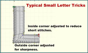
Typical small letter adjustments
When the user adjusts their lettering, the height of each letter is compared with alternate heights available. If your version is larger than the original, say 25mm (or about an inch) then the system will choose your version when the height needed is 25mm or larger. If your version is smaller, then the system will choose your version when the size gets down to your size, or lower.
Suppose you need to add several sizes: Let’s take the ‘larger’ series. The letter original is 10mm and you make one at 20mm and another at 30mm. As the user sizes the lettering design up, when that letter is 20mm tall, your first version (20mm) will be used. It will continue to be used from 20mm to 29.9mm. When the user makes that lettering 30mm or larger, your second version (the 30mm one) will be used.
The same thing happens as the user reduces the size of their lettering. Suppose you make versions of that same letter at 8mm and 5mm. When the user reduces the size of the lettering to 8mm or lower, your 8mm version is used. But if the user goes smaller to the point where the letter is 5mm or smaller, then your 5mm version will be used.
This allows you to have some guidance when digitizing. If you’re making a version that larger than the original, digitize it at its smallest useful size. And the opposite: If you’re making a smaller version of the original, make it at the largest size that you want it used.
You can always adjust the sizes of what you’ve made, if you find the need. By using the design itself to set the size, you can see the resultant stitches as they will generate in the lettering.
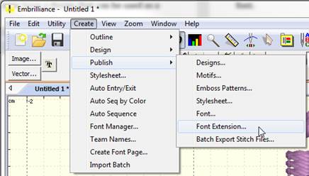
Publishing the Font Extension
Publishing the extension file saves it for use by the system. When a font is loaded, any extensions found are loaded with it. Font extension files do have some additional data contained within them, so you do need to take the step of publishing. The file itself, however, is a regular .BE working file and it can be opened and edited like any other, even after publishing.
Publish the font extension using the menu Create > Publish > Font Extension. Enter any copyright information you would like, then click ‘Ok’. Open a new design page and create a lettering design by clicking the ‘A’ on the main toolbar, as usual. Type your new extension lettering into the box to test the result.
You only need to save a BX version if you’re going to use it on more than one computer, or provide your file to others to use.