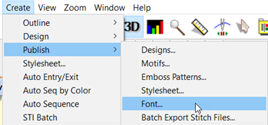
Object-based fonts can be published, which provide the user with full stitch generation as they create, modify and resize lettering designs. A font may be created on a design page (and saved normally as a .BE file) that will hold a set of designs, each design with one or more objects. Fonts may be multi-colored, and may use any stitch types, with the exception of automatic satin columns or objects with breaklines. Those require processing which makes their use in fonts slow or possibly with poor performance.
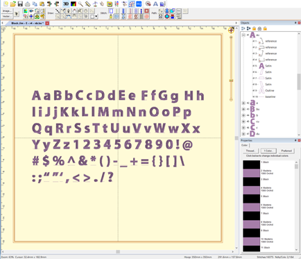
Fonts contain a set of individual glyphs such as the letters A-Z or punctuation. Each glyph on the design page is represented as a design. Thus, an English 26 letter alphabet will have 26 designs. If you add lowercase letters, you’ll have 52 designs, etc. It does not matter where on the page the designs are placed, nor does it matter in which order.
Each design is a glyph, named by the letter you type.
Each glyph, represented as a design, has a name. You can edit the names in the Object Tree by clicking on the name, which will make the name editable. The name is what the program will use to look up the design based on what the user types. Generally, you will just type one key for a design name. You may use upper and lower case in the naming; however, uppercase letters should be followed by a letter ‘u’, ex: ‘Au’, ‘Bu’, ‘Cu’...
If you are creating a monogram font that has position-dependent letters, you can create the left and right versions of the letters similarly (you won’t have lowercase), ex: ‘Al’, ‘A’, ‘Ar’, ‘Bl’, ‘B’, ‘Br’… There are also such things as four-position monograms, making use of a second name. To indicate the second name position, use ‘d’ ex: ‘Ad’.
Special characters such as punctuation are named normally. A comma is ‘,’. Try to remember that users need to be able to type the letter you are mapping in both Windows and Mac OS without Unicode.
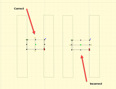
Each glyph has a baseline object at the end of the design. The lettering tool uses this to place the glyphs next to each other correctly. You do not need to create the baselines manually because the first publish cycle will add them for you if they’re not there already. You can then modify them up or down, as needed, to place the glyph vertically. As an example, the lowercase letter ‘y’ has a descender and you’ll need to move the baseline up accordingly. You may even set your baseline through the center or at the top of your glyphs, as required in monograms or other specialty fonts.
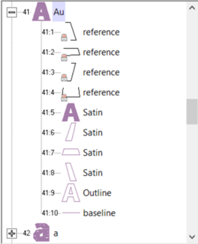
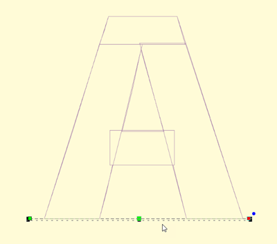
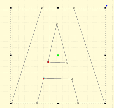
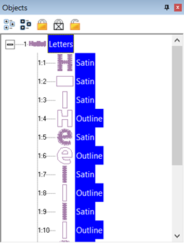
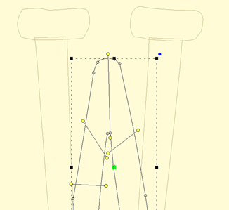
A typical letter design: Included are reference art, branched satin columns, an optional outline, and a baseline. Baseline and Outline are always Line object types. You do not need to draw the baseline. The first publish cycle will add one for you, which you can later adjust.
Baseline object selected
An optional outline selected
When the baselines are correct, and things look right, publish again to make use of the lettering.
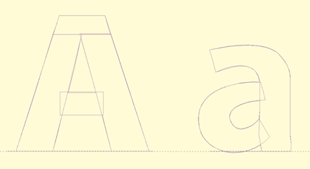
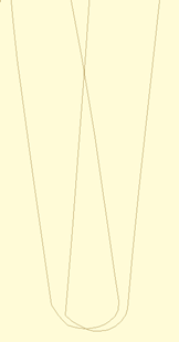
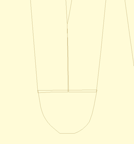
Letters on the baseline
If you have a row of letters, you might want to bring a rule down from the ruler at the top of the page to ensure that the letter heights are correct.
Note: The baseline must be the final object in each design, and must not have any stitches applied.
Reference art may be included in the working file. We usually label these as ‘reference’ and place them at the start, or start of each glyph, depending how they were drawn and imported. Once the art is in place, lock it using the Object Tree, which prevents inadvertent moves while digitizing.
We also create complete outlines as line objects. This is for planned releases. You need not have this, but it will be useful going forward.
When you publish a font, make sure that you have no lettering designs on any design page which have that font (if previously published) in use. If the font is in use, it cannot be updated by the publisher.
Publishing will place the font in your font folder as well as make that font instantly available to the lettering system.
When publishing a font, there are sizing issues to be aware of.
Current Size
A font is digitized at a certain size – that is to say, however you made it. Usually this is based on fitting the reference art onto the design page. In typography, the uppercase ‘M’ is often considered the reference letter for sizing, so if you don’t know what size to use, select the ‘M’ and look at its height. Set that value in the Current height box.
Default Size
Fonts will load at a default size. This is usually what the digitizer thinks of as the best size, or the size the work was created at to stitch optimally. Set this value in the Default. Often, it is the same size as the font has been digitized, therefore it would be the same as the Current height.
Minimum and Maximum Size
If you’ve played with embroidery fonts at all, you’ll know there are limits to how well they’ll stitch at various sizes. Often the limits of down to 50% or up to 250% are used, but you may wish to experiment and discover the usable limits of the font. These limits only stop the user from dragging the sizing handles with the mouse. They do not prevent someone from overriding those limits by typing a value into the selection tool pane.
Spacing
Letter and word spacing are set as a percentage of height, consistent with normal typography. A value of zero will cause letters or words to have no separation. A value of 100% will cause things to separate to the height on the font – almost always impossibly large. If you are unsure, try a small value for letter spacing. Play around until you like it. Then use a low multiple of that for word spacing, ex: 8% letter, 20% word.
Kerning
There is another process in typography called kerning. This moves pairs of letters closer together, making the text more readable. Most fonts will look better kerned. You might have something such as an athletic applique where the font is designed to be spaced evenly, and this is known as monospaced. That’s available by leaving the ‘Automatically kern’ checkbox unchecked. If you are unsure, check it.
Single color, satin-stitch-only, branched letters can be used as Nearest-Connecting-Point (NCP, or simply Nearest Point) letters. NCP lettering provides the ability to run right-to-left, center-out or any order the user wants, with minimum travel or jump distances. This happens because the letter’s stitches are sequenced so that the beginning and ending stitches are near to the previous and next letters in the sequence. When digitizing a font for NCP do not use runs to connect the satin elements, as these are created during branching. If the publishing system sees runs, it will not create an NCP letter, but will instead create a normal (and perfectly usable) letter, as-digitized.
Note: the satin branching keeps the order of your digitizing for layering purposes.
When publishing, you have choices for displaying the Nearest Point setting to the user on their Stitch properties of a lettering design. The choices are Always, Default On, Default Off and Never. The first three allow the use of the nearest point setting.
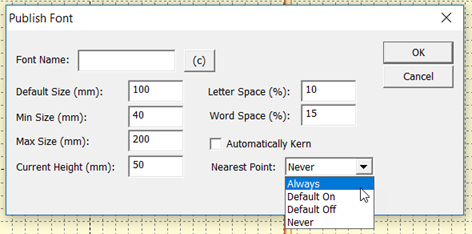
Always means you intend the font to always use the branching NCP engine. Use this when you haven’t set the individual glyph entry/exits because the font is known to operate well as branched. The use may not override this setting.
Default On / Off settings allow the user to override your preferred way of using the font. In most cases you will have digitized logical entry and exit points on all your glyphs. If you have done so, the font will sew as you intended it with the Nearest Point on or off, but Default On is preferred. Alternately, you may know that some combinations of letters are not as perfectly digitized as you would like, so you choose Default off, but leave the option up to the user.
Never means you have not designed the font to branch automatically.
Note: The Never setting does not mean you cannot branch within a glyph when digitizing it. You still can, and those branches remain exactly as you have set them. This setting is only to prevent the user from moving things around.
Automatic Branch
During the publish phase, if the setting is Default on or Always, the publishing system will check all the letters for you to see that they are (and are able to be) branched. If some are not, the system will branch those automatically, but only if they are all satin strokes.
Publishing a font includes an optional step of adding copyright information about the digitizer or company that has created the font. The copyright fields allow you to claim your work as your own and set permissions for its use. Each country has different copyright laws, though most are generally the same. The U.S.A. has certain oddities of copyright law regarding typefaces, so if you’re in business producing fonts, you might want to look those up. You can also state the terms of usage, such as allowing people to sell works created using your font.
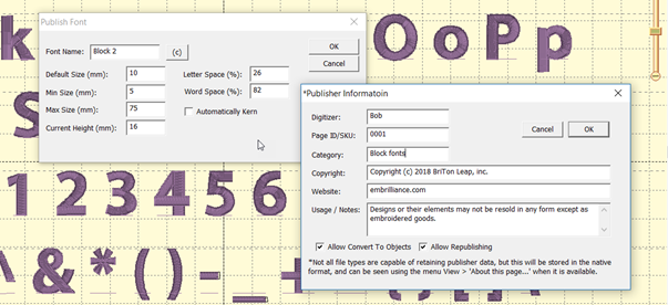
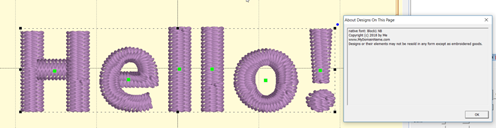
The copyright information is attached to each object in the published font forever, even if the user is allowed to convert the lettering to objects. Copyright information can be seen using the menu View>About this page….
If you have copyright information entered for the font, you will also be given a window to save the BX installer for that font. The BX files allow you to share or even sell your fonts easily. User need only double click the installer to load the font on Windows and/or MacOS.
Once you have entered publishing information, don’t forget to save the .BE file in order to store that data there too. Publisher information is stored in the file along with other data, and that is transferred to the objects as they are placed on the page with a lettering tool.
The Digitizer field should contain you or your company’s name. The optional Page ID is for those who track part numbers of their fonts, such as in an e-commerce solution. The category field places your font in a subfolder when installed, and may be useful in organizing fonts for the user. It is usually left blank.
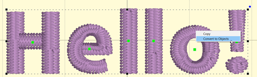
The checkbox, ‘Allow Convert to Objects’ does what its name states thus enabling the users who have a high-enough level of the digitizer to convert lettering designs into objects. This is your choice. It allows you to control how others use the lettering designs, whether they are installed with BX or even if you give them a .BE file. Some fonts are given out in .BE form as training guides or as part of something more useful, while others are commercial in nature and the digitizer prefers not to allow conversion of the lettering into objects.
Conversion into objects allows the user to take a glyph and manipulate it, which is commonly done for logo work. Many corporate logos begin with a typical typeface and have glyph manipulation to make it specific to that logo.
Objects that have been converted from a lettering design will contain the same copyright information when using the menu View > About this page.
The option Allow Republishing is for those very generous souls who allow others to add to, or modify, their work and pass it along. If another user has your .BE file, or has imported all the glyphs by converting lettering designs to objects, they may be allowed to make a new font out of it. Does this replace the original copyright? No. Those objects are always tagged with each copyright. The objects that the second user has modified will be able to have another copyright added to the original. This can go on through as many people as have republished the font. When more than one user’s work exists on the page, all copyrights will appear.
If any user limits what can be done with the font, only that user can adjust that setting. Subsequent publishers can add further restriction, but not remove any. When a font is published, the publisher’s serial number is turned into a unique identifier and placed in the copyright. This means a publisher can modify their own settings, but they may not modify another publisher’s settings.
We have made every effort to protect the work of individual digitizers. We use encryption that’s state of the art. Of course, hackers are always at work in the world, so there can be no guarantees. We all know that locks are generally to keep honest folk out, and that’s what this is: a set of locks. Of course, ordinary stitch files carry no information about their digitizer, and they’re easily copied by any user, so this is a big improvement over the status quo.
Foam fonts are published by setting the satin columns to the style, “Foam” or using an automatic foam endcap or plank in the column underlay properties. When publishing, the program notices the settings and flags the font automatically.
When lettering with a foam font, Stitch properties are not available, as the font should sew with the foam settings.
When digitizing fonts, any normal quality procedures and settings are going to work out. Remember that the user will have the ability to override your settings for density, pattern and underlay, so there is no need to make those adjustments across all letters. Keeping settings in synch is always a headache anyway, although the use of Quick Styles does help enormously.
When making NCP fonts, remember to use only satin columns, fully formed with inclination lines. Lay the satin columns in the order you would normally, as if you were digitizing for a single sew-out. The main difference is that you are leaving out connecting runs. For letters which are normally digitized with extra pieces to accommodate overlap, such as is often in ‘X’ or ‘k’, don’t break those strokes down. The branching engine will do that for the user.
Fonts typically have a wide size range and this causes issues with overlapping elements. Serifs can get partially obscured in an enlarged letter, so it might be best to consider sequencing those over the strokes that connect to them. Underlaps are needed more on small letters than large ones. As a letter is enlarged, you may see underlap build up a loft. Thus, we recommend having overlap, but keep it minimal. You do not want to perfectly butt-join objects, but rather prefer a minimal intersection, as necessary.
Remember that you can always edit a copy of your font at a larger size to make it stitch well at those larger (or smaller) sizes.
The best recommendation we have for those new to font digitizing is to look at our examples and then play with your own. Test, test, test. And, please, never charge a consumer for something you have never tested at all. Thank you!
When making fonts, there are some basics that you need to understand. First, and most important, is that fonts and embroidery are not friends. Font designers get away with things that embroiderers cannot. Most notably, font designers have no restrictions on stroke width – or the variability of it. A glyph can have a super narrow column alongside a super fat column. Assuming that you’re making a satin font, the lettering sizes are restricted by these column widths. A minimum column width of 1.5mm is typical. A maximum width of 7, 8 or even 9mm is about the most you will want to use, in general circumstances. If your glyph has sections that are 7mm wide and sections that are 2 mm wide, you have sizing constraints. The answer to this problem is to make the font stroke thickness more regular. Embroidery font designers do this all the time, and that’s often for fonts designed for a specific size. If you’re making fonts that should be able to scale up or down, you need to pay more attention to that problem.
The next issue is overlaps. Fonts on a computer don’t have layers -- the letter is a filled color. With embroidery you can see the order that the machine stitches the letter. And the human eye tends to have an opinion about what looks right in that circumstance. There are also embroidery-related reasons for having layers set correctly, particularly registration. Two satin strokes that touch may have a slight gap, or a slight overlap, both of which may not look right.
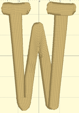
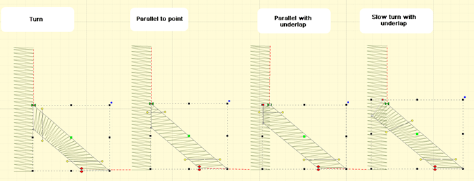
Another digitizing problem is turning acute angles. In a word, our advice is, “Don’t.” Take a look at the following image which shows three methods of turning tightly.
Three methods of turning
The bottom left, center, and bottom right are various methods of turning tightly. Can you spot the worst one right away? If you said the center, you are right. The center simply turns around, making long stitches and high density (even with short-stitching). This turn is ugly and unnecessary.
Look at the bottom right. This is a form of overlap, and there are a couple ways to do it. This way doesn’t look bad in many cases and is easy to accomplish. Its best benefit is that the stitch lengths remain at the width of the columns.
The bottom left has a couple things going on, including a cap object, which is shaped like a bowl at the bottom of the letter. It also has the two strokes coming down to the cap with nice, even, parallel stitches that actually shorten just a bit as they get close to the cap. The strokes do not overlap, but look like they do. They could overlap, but having them ‘kiss’ makes for better branching, as this will look the same, no matter which way the letter runs, left-to-right or right-to-left.
The downside of a cap is that it has to be a bit wide, and that width may make for a long stroke, so keep it in mind. A way of dealing with that problem is to adjust the shape of the letter.
At first glance, you may not see the difference. Here, we made the width of the cap narrower. In this case we set it to 7mm, which is comfortable to sew and that allows this letter to sew at 35mm in height. Notice that the left vertical stroke looks a bit wider at the top. We left it that way so you could see how the verticals should narrow a bit in order to meet the cap at its new width. You could accept the font like this, but it is more likely that you’ll narrow the whole column.
This version has been normalized a bit, so the columns are slightly narrower. The result for the embroiderer is that this letter can sew 25% larger than when it was faithful to the original art.
Digitize your lettering for the approximate size you want it sewn at. Naturally, having objects allows for the designs to be resized by the user, and that’s nice, but if you would like a small version of the font, makes one. Shrink it down in size and then study the column width. If you can, fatten them up a bit, and you’ll have a smaller version of your font.
Connecting strokes
Consider the angle at which strokes connect. Right angles make the strokes more obvious, tend to have shorter stitches, and provide branching a way to move to the next stroke.
Keep strokes nearly perpendicular wherever possible
Strokes at angles have another set of possibilities. When the angle is acute, you might be tempted to turn the inclination to be aligned with the stroke it is meeting. This can be done for shallow entry angles.
Stroke connection types
In the illustration we can see four common types of strokes. The Turn is the most common and has issues with high density along the inside edge. Short stitches can overcome this, as seen in the illustration, but it’s going to be a more textured edge than the others and should be avoided unless the turn is not significant.
The Parallel to Point is common, but has the disadvantage of bringing a satin down to a point, which contributes to knotting underneath the fabric and may even break needles.
Parallel with underlap has the advantage of smooth edges and prevents the point issues by allowing the final stitches (show here at the top of the right stroke) to have length reasonable enough to be sewn without trouble.
The shallow turn with underlap also works because the density variance is not so great as to attract attention and the final stitches are long. The amount of overlap this uses can be a bit much if you’re making large lettering. In that case, choose the Parallel with Underlap.
For small lettering you might consider a combination, shaped similar to the parallel underlap but with the gradual turning inclination.
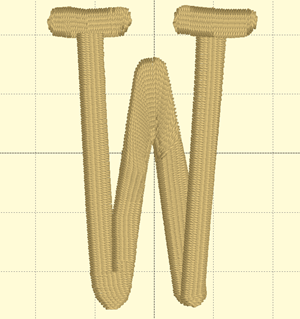
Whatever methods you employ, keep them consistent across the font, where possible, especially in similar letters, such as M, N W, V. Bear in mind the likely size of the letters when sewn, as size affects what you’ll do when digitizing.
Size
The size you digitize to is somewhat important. If you digitize at a large size, you’ll notice the design will change slightly when reduced. Inclinations that look good at a larger size may not be appropriate when the font is made small. We recommend you digitize the lettering at the default size you want the font, then edit it at the smallest size you think it should go. Going up in size does introduce some other issues but they are less profound then going down in size.
When patterns are applied to satin objects, that pattern will be kept throughout the usage of lettering. It will not be overridden by the automatic pattern filling system in the lettering engine. This allows the digitizer to specify the look of specific elements of the design. This is normally not assigned for lettering, but is an option.
Naming of column objects can affect their adjustment in the lettering generation process. Manual underlay columns, sometimes used to connect perpendicular junctions, should not have additional underlay applied to them during the lettering generation process. To prevent this, rename the column in the object tree. Name them something such as ‘Underlay’ and they will not have their underlay settings adjusted.
The menu item Create > Publish > Create Font Page… displays the operating system’s font selection window. Once you choose a font, the program will create a new design page, on which will be a design for each glyph in the typical font. This is a convenience item for those times you are using TrueType as art.
Remember that most TT fonts have too many nodes and wildly different stroke widths, so they are not usually good candidates for embroidery unless you modify them heavily.
Each glyph comes in as a design, already named, along with bitmap, baseline, and outlines for the glyph. We suggest you use the bitmap and digitize over it. Breaking the outline into individual strokes usually will take longer, and you’ll still have to compensate the objects by overlapping them slightly.
You can delete the designs you don’t need and/or add more than what comes in from the tool.
Due to the wildly different methods used by font designers to publish their font, this tool is not able to be supported for specific fonts. It can only work with the data given. If you see something strange or undesirable, delete it.