 Creating a simple
letter design or monogram is, well, simple! Just click the Create Letters tool
found on the Design Toolbar. This action will place the new lettering in the
center of the design page and display the Letters Property tab.
Creating a simple
letter design or monogram is, well, simple! Just click the Create Letters tool
found on the Design Toolbar. This action will place the new lettering in the
center of the design page and display the Letters Property tab. Creating a simple
letter design or monogram is, well, simple! Just click the Create Letters tool
found on the Design Toolbar. This action will place the new lettering in the
center of the design page and display the Letters Property tab.
Design Toolbar
The Embrilliance platform supports two types of lettering:
1.) Built-in Fonts
2.) Stitch file collections (Imported Fonts)
The built-in fonts are based on our software, and offer many features, and are available in purchased products, such as Essentials or Font Collections.
Stitch File collections are those brought in as a .BX file which installs a font from an outside digitizing source, such as a font provider on the internet. Stitch File fonts also can be created using our AlphaTricks product. When using a stitch-file font, your ability to re-size it will depend on what products you have licensed. AlphaTricks and Essentials will both let you re-size the fonts and recalculate their stitches, whereas the free Express Mode will not.
This manual section will present the basics of manipulating lettering, which works nearly identical regardless of which font type you are using.
If you have a product with built-in fonts, the program gives you significant control over them. The specifics vary depending on which lettering style you’re using, but in general, you can adjust the font, color, size, aspect, center, rotation, mirroring, slant, kerning, layout, stagger, sequence, envelope shape, stitching properties including density, underlay, underlay density and compensation (which can be used to increase boldness) for the design as a whole. Furthermore, you can adjust the color, size, position, rotation, kerning, aspect and mirroring down to the individual letter. You can adjust the letter sequence for Monograms so that letters may overlap exactly how you want them. And if you do overlap your letters within a Monogram, the hidden stitches are automatically removed for you so that the design sews out nice and flat. For fast and easy Monogram setup, you have 14 Quick Styles to layout your design, including Vertical, Square, Oval and Diamond.
When sizing letters, your letters automatically switch to a fill-like satin stitch. This looks like a fill, but unlike a fill, the stitches maintain the beauty of the curved satin column. Another benefit of this is that fonts can be made far larger than ordinary embroidery fonts - some as tall as 8”.
To make the fonts even more versatile in size, automatic adjustments are made for you to help the letters sew in a smaller size than they would in other programs. For instance, when you make the letters smaller, narrow satin stitching is automatically adjusted to keep long-enough stitches to actually sew. Although some small designs look good on screen, they won’t embroider well. The fonts in the program protect your stitching automatically.
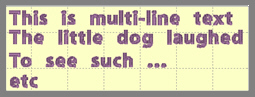
Multi-Line text offers line spacing options. Circle Text lets you keep on typing, right into a spiral!
The platform can further be extended by adding font and design packs, now available from your favorite digitizer, sewing machine dealer or online at http://www.Embrilliance.com.
Traditionally, monograms were a single letter— “mono” meaning one and “gram” referring to the letter. Today most monograms are three-letter combinations with the center letter larger than the outer two.
Fonts or letters styled specifically for such monograms are prefixed with “MGM” to distinguish them easily from more standard fonts. Of course, you can make a monogram with any font style and use the enveloping features to shape the design.
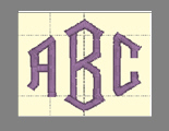
Monogram using MGM Diamond
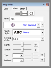
Monogram Properties on the Single Line Page
Now, set the monogram to your desired value by typing into the Text box and pressing the ‘Enter’ key.
Although the fonts prefixed with “MGM” are designed for traditional three-letter monograms, you are by no means restricted to three letters. For example, if you just want the large center letter, enter a space and the character you want.

Type a space before a letter for a large single letter
For fun, you can use a monogram font with entire words. This method works best with all capital letters and fairly short words.

Sample above uses MGM Rounded applied to a word.
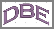
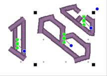
Overlapping letters are sometimes needed for your design, and when you do that within a lettering object, the stitches that are hidden get removed automatically:

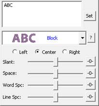
The Letters Property tab provides a number of tools that allow the design to be customized.
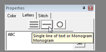
There are three basic styles for lettering:
•
 Multi-Line Text
• Single line of text or Monograms
• Text on a Circle
The lettering design can switch between these styles using the three buttons at the top of the property tab as shown above.
Multi-Line Text is useful when you want to enter an entire saying, poem, etc.
Single line of text or Monograms is useful for entering a single line of text or a Monogram. With a single line of text there is more flexibility in the shape such as the enveloping feature. With Monograms there are some fun Quick Styles that re-shape the 3-letter monogram and when overlapping the monogram letters, the Sewing Order finishes the look.
Circle Text wraps lettering around a circle. If you overflow the number of letters that can fit on the circle, you will see your text spiral outwards. To see the text on a circle, you will have to adjust the ‘Radius’ of the circle using the slider.
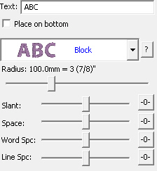

Spiral text starts in the center.
When writing on a circle, you have the option to put text either on the inside or outside; when embroidering, we usually think of this as text at the bottom or top of a circular patch or badge. To switch this, use the checkbox labeled “Place on bottom.”
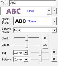
The font and style are changed using the selections in the Font and Monogram Style boxes.

Monogram Quick Style menu
When lettering is initially placed on the page, the letters are automatically kerned (letter spacing) for a good visual effect. Note that these styles are designed to accomplish traditional monograms, and therefore some only work properly with two or three letters.
Some fonts may only have uppercase letters. If you’re using a font and not seeing the desired characters, clicking the ‘?’ button to the right of the Font box; it will display all characters available in the selected font along with size recommendations.

Characters available shown with recommended size ranges.

Some of you have a zillion mapped fonts. Great! But you have the long list to scroll through. Click the arrow to pop-up the list of fonts. Now, type the first few letters of what you're looking for. You can type and even backspace.
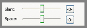
The slant of a monogram and the spacing of the monogram letters are controlled with the Slant and Space slider controls. If you use these controls and want to return the monogram to its default settings, simply click the zero control. This will restore the default setting. The Slant gives an italic effect to the monogram.
The envelope (containing top and bottom outlines) of the lettering (single or multi-line) can be individually customized. The Envelope Type box and Envelope Slider control the envelope. There is an Envelope Slider control for the envelope top and there is an envelope slider control for the envelope bottom. There are four styles of envelope: Curve, Grow, Peak and Shrink.
If you use these controls and want to return the lettering to its default setting simply click the zero control.

Enveloping Curved Top and Bottom Envelope
Enveloping can produce a variety of creative designs, especially when you begin breaking up the words into segments and enveloping each one separately.

Sample above uses two envelopes and a lower case “o” resized for bubbles.
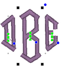
Change the color of a single letter by selecting that one letter. To select it, first make sure the lettering object or monogram is selected, then click on the green handle that appears centered over the letter you want to change. Once a single letter is selected, change the color(s) of just that one letter using the color property page as described previously.
For more information on threads and colors, see the section on Color.
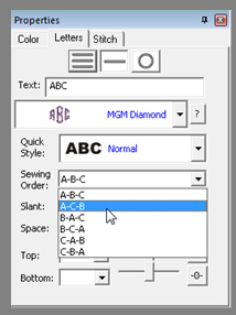
On the Letters tab there is a Sewing Order box. Choose the order in which the letters are sewn from this control. For a simple monogram you probably do not want to change the default order. However, if you want to overlap the center letter on the others, you could choose the ‘ACB’ order (second choice).
The Stitch tab contains controls for the actual stitch generation of the Lettering.
Note: This is the tab for built-in fonts. See below about imported fonts.
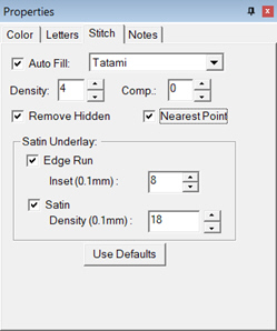
Satin Density Control: This control ranges from 3 to 20 with each tick representing 0.1mm. So, the range in millimeters is .3 to 2.0 mm. The smaller the density number the closer together the satin stitches will be. Normal is 0.4mm.
Compensation: This control ranges from 0 to 10 with each tick being 0.1 millimeter. As the value increases the stitch length increases, in effect ‘fattening’ the stitching. This is useful on fabrics that have a loft or nap, and can also be used to make a font appear bolder.
Remove Hidden: When selected, stitches that are completely hidden by top stitches will be removed. This process allows the design to sew with less density. Note that this only affects stitching within the monogram itself, for instance where one letter is positioned on top of another letter.
Nearest Point: When this is available, it allows the lettering to adjust the entry and exit points for each letter to minimize travel to its neighbors. This will also work for alternate sewing sequences such as center-out or right-to-left. Not all fonts have this ability, so it is up to the digitizer.
Edge Run: When checked, this adds a running stitch underlay. This setting is the amount of inset for the edge run and ranges from .1 to 1.2 mm. A normal edge-run amount is 0.8mm (about the width of a typical needle)
Satin: When checked, this adds a satin underlay. When checked, it applies the density value, which ranges from .3 to 2.0 mm just like the satin stitch.
The Set Defaults button restores each of these controls to their default values.
Note: This is the Stitch tab for imported fonts with a licensed product such as Essentials.

Imported fonts are really just merged stitch files, with a few extras built-in for alignment. These fonts may have been added using a .BX-format installer or with the Import Font window if you have a product such as AlphaTricks.
Because the stitches already exist at whatever density the digitizer created them with, all you can do to the density is modify it – and you do that with a percentage. Likewise, if any of the stitches are recognized by the program as fills, we can adjust the percentage of the density here too. Sliding the sliders right, for example to 10% will add 10% more stitches, while keeping the size of the lettering the same. More density provides more coverage, but too much density sews thick and noisy and can pucker the fabric.
The compensation tool, “Comp,” is used to slightly fatten the lettering. This can be useful for a better look on the font if it is too thin or is being sewn on a pile fabric. If you make the font too fat though, you can move to far from any edge run that may exist, which would alter the look at the edge of the satin.
The Remove Hidden Stitches function allows you to position one letter on top of another and have the program remove hidden stitches underneath. This also works with applique lettering, where the top-stitch will be removed, but Position and Material runs will be left intact.
The ‘Limit Satin Length’ option is used to help prevent looping on top of the fabric and reduce ‘snag-ability’ from long satin stitches. There are several options to choose from when the lengths are long. An ‘Anchor’ is a simple run that’s placed every other line of stitching. This allows the alternating satin strokes to cover the added needle penetrations. The result is a reasonably smooth stitch, almost as smooth as a satin, but well tacked down, and not likely to snag or loop. ‘Length Limit’ is one traditional look to anchor the satin, and it will simply drop the needle whenever the stitch is too long. ‘Split’ will insert a needle land in the middle of any stitch that’s too long, which results in the look of a split-satin, or columnar appearance.
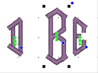
 You can manipulate text to form a shape or
path. Each letter has several handles to accomplish this. Click on a letter’s
center green handle to select that letter.
You can manipulate text to form a shape or
path. Each letter has several handles to accomplish this. Click on a letter’s
center green handle to select that letter.
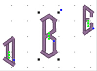
The center handle will move that letter.
The green pennant handle on top of the center will stagger the letters from that one forward:


The blue handle at the center rotates the letter and all subsequent letters. The green pennant under the center handle will move that letter and all the letters on the line following it.

Using these handles, you can make your letters into virtually any shape.
A Closer Look: You can manipulate text to fit virtually any kind of path using the handles for the text design as well as the individual letter and rest-of-line handles. The letters have additional control handles that display when the monogram is selected:
Letter Size and Rotation: As with any design, the letter itself has four black handles for resizing, and a blue handle at the top, right used to rotate the letter on its own.
End-of-Line Handles: Note the Center Green Handle in each letter.
This handle that appears in the center of a letter when the lettering design is selected and it is used to move the individual letter. Simply click on it and drag the letter to the desired position.
Clicking the center green handle also allows you to change the color of that letter only, leaving the others untouched. Use the Colors page in the Property Sheet to change the letter color, as you would change any color layer in a design.
Clicking on the green center handle displays three additional handles. These handles give a wide range of control over the positioning of the letters. The handles work on the selected letter and all letters to the right of the selected letter. Let’s take a closer look at these handles:
Top Green Handle: The handle over the center handle is a line stagger. This handle staggers the letters vertically and changes the spacing simultaneously. The example shows a stagger upward.
Bottom Green Handle: This handle is the kerning handle. It can be used to move letters beginning with the one selected to the end of a line.
This handle moves the letters to a new location without affecting the spacing on anything from the selected letter forward to the end of the line.
Center Blue Circle Handle: This handle is another tool that moves all text until end-of-line. This handle rotates the letters around the center of the selected letter.
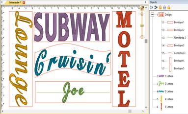
You can design templates for lettering to use in name drops, word walls, subway art, etc. Templates are interactions between two different elements: A lettering design, and a template object. To accommodate multiple template designs on a page, the template and lettering items are named using a numbering system that will match them together.
The lettering works with the built-in fonts or any .BX fonts. The templates work with lettering of a normal single-line style only. Template objects must be native objects from the Create Mode of the platform, and the stitch type must be Line, not Run or other stitch type. Template objects may be drawn if you have the tools, or if a .BE working file has template objects within it, you can use those.
There are three types of template objects: Namedrop, Envelope and Baseline. Use the object tree to name the shape with one of those names, followed by a number, ex: namedrop 1
To associate a lettering design with a template, add the matching number to its name, ex: letters 1
Once you have the names matching, use the letter properties to generate the letters – type or hit enter, or adjust one of the properties on the page to cause the lettering to regenerate. When the lettering generates, it looks up through the design layers (earlier in the design) for matching template objects. Once found, the template and the lettering work together.
The template object must be in a design that comes before the lettering design. When the lettering design gets updated, it only looks backward to see if there is a matching template for it to use.
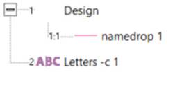
Lettering used with templates has optional parameters, depending on the template object. You can add the parameter to the lettering name, ex: “letters –c 2”. This example will cause the lettering to use the template object with a number 2 at the end of its name (ex: “baseline 2”) and also will center the design.
You can place all your template objects in one design, which is customary. As long as that design comes before the lettering designs in the sequence, the template items will be found. You do not need to have the template objects in any order; the sequence of the lettering designs controls the sewing order. All that matters is that the index numbers in the names match.
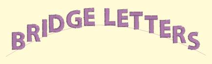
The simplest of the template forms is a namedrop. It is a simple 2-point line, running left to right, which controls where lettering will be placed.
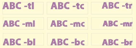
Namedrops have the options: –c (center), -l (left), -r (right), -j (justify), -m (middle), -t (top). These options inform the template where on the line to place the lettering. The middle and top options refer to vertical placement.
Namedrop shapes can be named using the options along with a number, ex: “namedrop –cm 1” will cause “letters 1” to be placed in the center horizontally and middle vertically. If the letter name specifies a different option, that will override the template name.
Once the lettering is linked with the template, most of the normal lettering handles still do all the regular operations such as move and rotate. The only difference is that the lettering will always stay on the template line.
If you have StitchArtist, information about drawing namedrops can be found in the ‘Drawing Lettering Templates’ section of this manual.
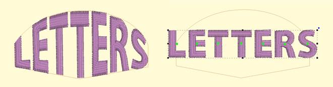
Envelopes can yield effects from simple placement to re-shaping of the lettering.
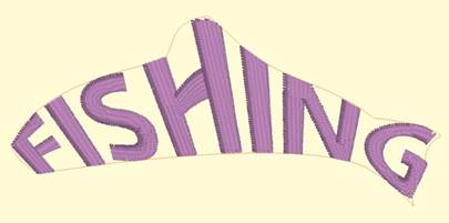
The options for envelopes are: –c (center), -l (left), -r (right), -m (middle), -t (top), -b (bottom).
These options control placement of lettering within the template. If no options are specified, the template will stretch the lettering design to fill the envelope.
As with namedrop, envelope shapes can be named using the options along with a number, ex: “envelope –cm 1” will cause “letters 1” to be placed in the center horizontally and middle vertically. If the letter name specifies a different option, that will override the template name.
Envelopes have a unique ability: They allow editing as visually normal letters when selected. To see the lettering in the envelope, click off the letters (de-select them).
If you have StitchArtist, information about drawing envelopes can be found in the ‘Drawing Lettering Templates’ section of this manual.
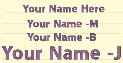
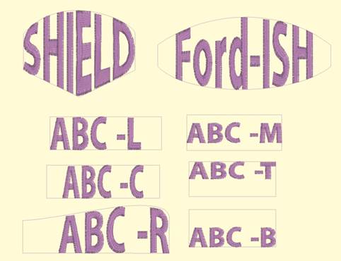
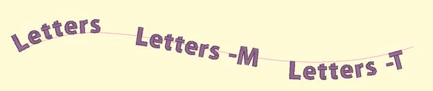
Baselines provide a means for lettering to follow on a path, whether open line or closed shape.
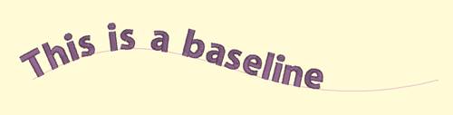
Lettering with baselines have the options: -m (middle), -t (top), -b (bottom), -c (center).
Note: The lettering design gets named with the option, not the baseline. Baseline names would be simply “baseline” followed by a number, ex: “baseline 1”.
There is an additional option for closed shape baselines: -l (lower) or –u (upper).
Baselines have pre-determined default settings which can be overridden by the lettering options. An open baseline will initially place the lettering at the left start of the shape. Closed shape baselines will place the lettering at the top, centered.
The control handles for lettering work slightly different on a baseline. The center handle, used to select a letter, also will allow the letter to be placed anywhere both vertically and horizontally on the baseline.
The lower pennant handle causes the lettering to move along the baseline, and to have all the letters to the right of it follow. The pennant handle above the center causes the letter to move above or below the baseline and all the letters following will do the same.
The rotation handle connected to the center handle causes the letter to rotate and all the following letters rotate in place to match.
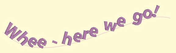
The middle and top options describe how the lettering will be placed vertically along the baseline. Top indicates that the top of the lettering design will be placed along the baseline. Middle places the lettering design centered vertically on the baseline. Bottom is the default, so no option is required unless using the –l (lower) option.
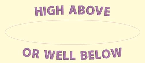
When using a closed shape, such as a circle, it is often desired to place lettering both above the top and below the bottom of the circle. This can be accomplished with two lettering designs, one for the top, and one for the bottom. This allows each line of text to have its own settings, even a separate font. When specifying that the lettering will go to the bottom of the shape, and the –l (lower) parameter. The template will switch the default placement to –t for lower shape lettering. You can change this using –m or –b.
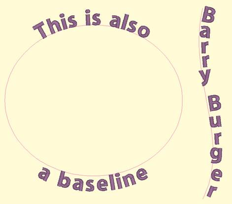
You can achieve any letter placement with a baseline. Even ‘wavy’ vertical text can be accomplished using a vertical line and rotating the letters using the center rotation handle.
If you have StitchArtist, information about drawing baselines can be found in the ‘Drawing Lettering Templates’ section of this manual.