Object-based fonts can be published, which provide the user with full stitch generation as they create, modify and resize lettering designs. A font may be created on a design page (and saved normally as a .BE file) that will hold a set of designs, each design with one or more objects. Fonts may be multi-colored, and may use any stitch types, with the exception of automatic satin columns or objects with breaklines. Those require processing which makes their use in fonts slow or possibly with poor performance.
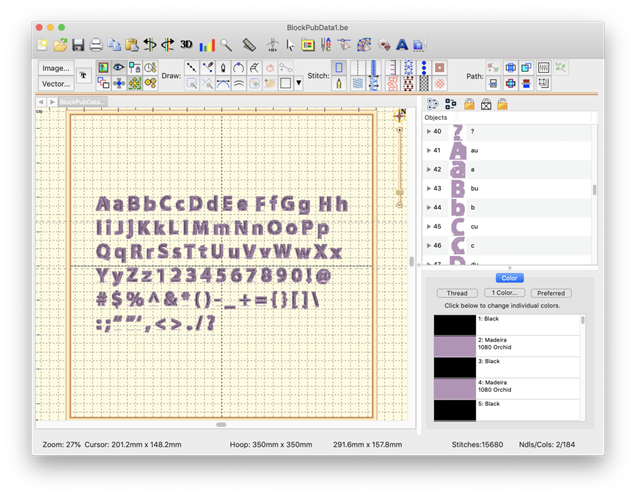
Fonts contain a set of individual glyphs such as the letters A-Z or punctuation. Each glyph on the design page is represented as a design. Thus, an English 26 letter alphabet will have 26 designs. If you add lowercase letters, you’ll have 52 designs, etc. It does not matter where on the page the designs are placed, nor does it matter in which order.
Each design is a glyph, named by the letter you type.
Each glyph, represented as a design, has a name. You can edit the names in the Object Tree by clicking on the name, which will make the name editable. The name is what the program will use to look up the design based on what the user types. Generally you will just type one key for a design name. You may use upper and lower case in the naming, however, uppercase letters should be followed by a letter ‘u’, ex: ‘Au’, ‘Bu’, ‘Cu’...
If you are creating a monogram font that has position-dependent letters, you can create the left and right versions of the letters similarly (you won’t have lowercase), ex: ‘Al’, ‘A’, ‘Ar’, ‘Bl’, ‘B’, ‘Br’… There are also such things as four-position monograms, making use of a second name. To indicate the second name position, use ‘d’ ex: ‘Ad’.
Special characters such as punctuation are named normally. A comma is ‘,’. Try to remember that users need to be able to type the letter you are mapping in both Windows and Mac OS without Unicode.
Each glyph has a baseline object at the end of the design. The lettering tool uses this to place the glyphs next to each other correctly. You do not need to create the baselines manually because the first publish cycle will add them for you if they’re not there already. You can then modify them up or down, as needed, to place the glyph vertically. As an example, the lowercase letter ‘y’ has a descender and you’ll need to move the baseline up accordingly. You may even set your baseline through the center or at the top of your glyphs, as required in monograms or other specialty fonts.
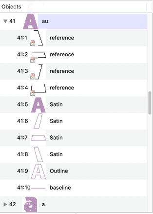
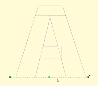
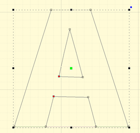
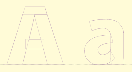
A typical letter design: Included are reference art, branched satin columns, an optional outline, and a baseline. Baseline and Outline are always Line object types. You do not need to draw the baseline. The first publish cycle will add one for you, which you can later adjust.
Baseline object selected
An optional outline selected
When the baselines are correct, and things look right, publish again to make use of the lettering.
Letters on the baseline
If you have a row of letters, you might want to bring a rule down from the ruler at the top of the page to ensure that the letter heights are correct.
Note: The baseline must be the final object in each design, and must not have any stitches applied.
Reference art may be included in the working file. We usually label these as ‘reference’ and place them at the start, or start of each glyph, depending how they were drawn and imported. Once the art is in place, lock it using the Object Tree, which prevents inadvertent moves while digitizing.
We also create complete outlines as line objects. This is for planned releases. You need not have this, but it will be useful going forward.
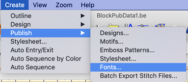
When you publish a font, make sure that you have no lettering designs on any design page which have that font (if previously published) in use. If the font is in use, it cannot be updated by the publisher.
Publishing will place the font in your font folder as well as make that font instantly available to the lettering system.
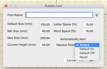
When publishing a font, there are sizing issues to be aware of.
Current Size
A font is digitized at a certain size – that is to say, however you made it. Usually this is based on fitting the reference art onto the design page. In typography, the uppercase ‘M’ is often considered the reference letter for sizing, so if you don’t know what size to use, select the ‘M’ and look at its height. Set that value in the Current height box.
Default Size
Fonts will load at a default size. This is usually what the digitizer thinks of as the best size, or the size the work was created at to stitch optimally. Set this value in the Default. Often, it is the same size as the font has been digitized, therefore it would be the same as the Current height.
Minimum and Maximum Size
If you’ve played with embroidery fonts at all, you’ll know there are limits to how well they’ll stitch at various sizes. Often the limits of down to 50% or up to 250% are used, but you may wish to experiment and discover the usable limits of the font. These limits only stop the user from dragging the sizing handles with the mouse. They do not prevent someone from overriding those limits by typing a value into the selection tool pane.
Spacing
Letter and word spacing are set as a percentage of height, consistent with normal typography. A value of zero will cause letters or words to have no separation. A value of 100% will cause things to separate to the height on the font – almost always impossibly large. If you are unsure, try a small value for letter spacing. Play around until you like it. Then use a low multiple of that for word spacing, ex: 8% letter, 20% word.
Kerning
There is another process in typography called kerning. This moves pairs of letters closer together, making the text more readable. Most fonts will look better kerned. You might have something such as an athletic applique where the font is designed to be spaced evenly, and this is known as monospaced. That’s available by leaving the ‘Automatically kern’ checkbox unchecked. If you are unsure, check it.
Single color, satin-stitch-only, branched letters can be used as Nearest-Connecting-Point (NCP, or simply Nearest Point) letters. NCP lettering provides the ability to run right-to-left, center-out or any order the user wants, with minimum travel or jump distances. This happens because the letter’s stitches are sequenced so that the beginning and ending stitches are near to the previous and next letters in the sequence. When digitizing a font for NCP do not use runs to connect the satin elements, as these are created during branching. If the publishing system sees runs, it will not create an NCP letter, but will instead create a normal (and perfectly usable) letter, as-digitized.
Note: the satin branching keeps the order of your digitizing for layering purposes.
When publishing, you have choices for displaying the Nearest Point setting to the user on their Stitch properties of a lettering design. The choices are Always, Default On, Default Off and Never. The first three allow the use of the nearest point setting.
Always means you intend the font to always use the branching NCP engine. Use this when you haven’t set the individual glyph entry/exits because the font is known to operate well as branched. The use may not override this setting.
Default On / Off settings allow the user to override your preferred way of using the font. In most cases you will have digitized logical entry and exit points on all your glyphs. If you have done so, the font will sew as you intended it with the Nearest Point on or off, but Default On is preferred. Alternately, you may know that some combinations of letters are not as perfectly digitized as you would like, so you choose Default off, but leave the option up to the user.
Never means you have not designed the font to branch automatically.
Note: The Never setting does not mean you cannot branch within a glyph when digitizing it. You still can, and those branches remain exactly as you have set them. This setting is only to prevent the user from moving things around.