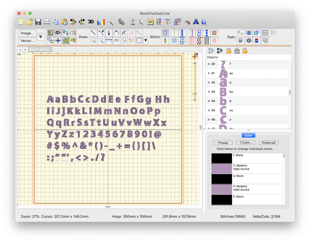
Object-based fonts can be published, which provide the user with full stitch generation as they create, modify and resize lettering designs. A font may be created on a design page (and saved normally as a .BE file) that will hold a set of designs, each design with one or more objects. Fonts may be multi-colored, and may use any stitch types, with the exception of automatic satin columns or objects with breaklines. Those require processing which makes their use in fonts slow or possibly with poor performance.
Fonts contain a set of individual glyphs such as the letters A-Z or punctuation. Each glyph on the design page is represented as a design. Thus, an English 26 letter alphabet will have 26 designs. If you add lowercase letters, you’ll have 52 designs, etc. It does not matter where on the page the designs are placed, nor does it matter in which order.
Each design is a glyph, named by the letter you type.
Each glyph, represented as a design, has a name. You can edit the names in the Object Tree by clicking on the name, which will make the name editable. The name is what the program will use to look up the design based on what the user types. Generally you will just type one key for a design name. You may use upper and lower case in the naming, however, uppercase letters should be followed by a letter ‘u’, ex: ‘Au’, ‘Bu’, ‘Cu’... If you are creating a monogram font that has position-dependent letters, you can create the left and right versions of the letters similarly (you won’t have lowercase), ex: ‘Al’, ‘A’, ‘Ar’, ‘Bl’, ‘B’, ‘Br’…
Special characters such as punctuation are named normally. A comma is ‘,’. Try to remember that users need to be able to type the letter you are mapping in both Windows and Mac OS without Unicode.
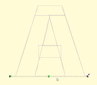
Each glyph has a baseline object at the end of the design. The lettering tool uses this to place the glyphs next to each other correctly. You do not need to create the baselines manually because the first publish cycle will add them for you if they’re not there already. You can then modify them up or down, as needed, to place the glyph vertically. As an example, the lowercase letter ‘y’ has a descender and you’ll need to move the baseline up accordingly. You may even set your baseline through the center or at the top of your glyphs, as required in monograms or other specialty fonts.
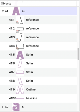
A typical letter design: Included are reference art, branched satin columns, an optional outline, and a baseline. Baseline and Outline are always Line object types. You do not need to draw the baseline. The first publish cycle will add one for you, which you can later adjust.
Baseline object selected
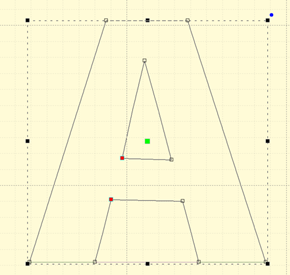
An optional outline selected
When the baselines are correct, and things look right, publish again to make use of the lettering.
Letters on the baseline
If you have a row of letters, you might want to bring a rule down from the ruler at the top of the page to ensure that the letter heights are correct.
Note: The baseline must be the final object in each design, and must not have any stitches applied.
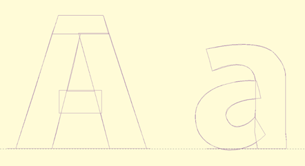
Reference art may be included in the working file. We usually label these as ‘reference’ and place them at the start, or start of each glyph, depending how they were drawn and imported. Once the art is in place, lock it using the Object Tree, which prevents inadvertent moves while digitizing.
We also create complete outlines as line objects. This is for planned releases. You need not have this, but it will be useful going forward.
When you publish a font, make sure that you have no lettering designs on any design page which have that font (if previously published) in use. If the font is in use, it cannot be updated by the publisher.
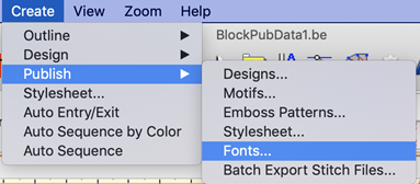
Publishing will place the font in your font folder as well as make that font instantly available to the lettering system.